인문학
사회과학
자연과학
공학
의약학
농수해양학
예술체육학
복합학
 DBpia AI
 AI 에이전트
 AI 아이디어
 AI 리더
 AI 뷰어
 Citeasy
크롬 서지관리 다운로드
지원사업
학술연구/단체지원/교육 등 연구자 활동을 지속하도록 DBpia가 지원하고 있어요.
커뮤니티
연구자들이 자신의 연구와 전문성을 널리 알리고, 새로운 협력의 기회를 만들 수 있는 네트워킹 공간이에요.
피인용 0
초록·키워드
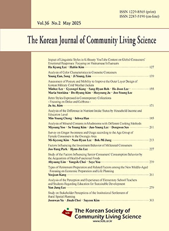
This study analyzed the color and tone of containers for 84 product lines of 12 global cosmetics brands. Through this, the relationship between color image and symbolism, product components and functions, and brand identity was examined. R was used mainly for anti-aging products. The basic and deep tones convey luxury and efficacy, often reflecting the unique colors of the ingredients. In YR, the color tone changed according to the characteristics of the ingredients, such as roses, kombucha, and calendula, rather than functions. Y was used to express a high-end image using the gold tone and was used only for the anti-aging line. G was used to emphasize naturally derived ingredients in the moisture line. B delivered the feeling of freshness in the moisture product, and deep blue delivered the sense of trust in the anti-aging product. P appeared only in anti-aging products, and the premium image was highlighted by the vivid and deep tones. Among the neutral colors, white was used most to indicate function, and black and gray were limited to some anti-aging products. The selection of color and tone according to the function plays an important role in the delivery of product messages, and the unique color reflection of raw materials was effective in reinforcing the ingredient association and visual message delivery.
본문·목차


인공지능 문자 인식 모델을 통해 추출된 텍스트로, 일부 오타나 오류가 포함될 수 있으나 지속적으로 개선 중입니다.
오류를 발견하셨다면 해당 부분을 드래그한 후 ' 를 통해 신고해주세요.
오류를 발견하셨다면 해당 부분을 드래그한 후 ' 를 통해 신고해주세요.
최근 본 자료 전체보기




UCI(KEPA) : I410-151-25-02-093087498